Carla Liu
AIP Bonsai
Bringing Bonsai and Lifestyle to the World with Seamless Online Shopping
Care Guide Page
The Care Guide Page is designed to give users quick and easy access to bonsai care information. It serves as a helpful resource for users who want to learn more about how to properly maintain their bonsai. The layout is simple, making it easy for users to browse through different care topics and find exactly what they need.
Users can easily switch between sections such as Introduction, Watering, Light & Ventilation, Fertilization, Soil, and Repotting using a navigation bar that is conveniently placed within the page. The Repotting section follows a step-by-step format to guide users through each stage of the repotting process, ensuring clarity and ease of use.
Each section provides straightforward advice and practical tips, helping users feel confident in caring for their bonsai. The goal of this page is to deliver essential information in a clear and accessible way, making it easier for users to take care of their plants.
Summery of the Design
The redesign of the AIP Bonsai website focused on improving the site's structure and navigation by addressing key issues with the original sitemap. Important sections like "Services" and "Care" were previously hidden under the "About" page, so I reorganized them into their own dedicated pages to enhance accessibility. The shop page was simplified by reorganizing product categories and making it easier for users to explore bonsai, furniture, and clothing. In the care guide, I introduced a step-by-step format, especially for the repotting instructions, to improve usability. Overall, the redesign prioritized user-friendly navigation and clearer access to the full range of AIP Bonsai’s offerings.
Service Page
Originally, the Service Page was hidden under the "About" section, making it difficult for users to find. I redesigned it as a standalone page under the main menu, making it easier for users to discover the full range of services AIP Bonsai offers. This page highlights not just the sale of bonsai, but also additional services like bonsai care and landscaping. The design is simple and focused, allowing users to quickly see the various services available. Clear calls to action are placed throughout the page, making it easy for users to book a service when they’re ready. This redesign improves visibility and helps users understand that AIP Bonsai offers more than just products, but also valuable services to meet their needs.
Shop Page
For the AIP Bonsai project, I focused on creating a user-friendly and intuitive shopping experience. The Shop Page was designed to simplify navigation and improve how users interact with the product offerings. This page plays a critical role in helping users find what they are looking for with ease.
Key Features:
Clear Product Categorization: At the top of the page, I featured detailed product categories like "View All Bonsai," "Premier Bonsai," and "Juniper Bonsai," allowing users to quickly dive into specific offerings. Broader product categories such as bonsai, furniture, and clothing are positioned at the bottom, giving users the flexibility to explore a wider range of products.
Product Highlighting: Each product is presented with high-quality images and titles, making it easy for users to browse and identify items of interest. The layout is clean and simple, focusing on providing a smooth browsing experience.
Navigation Choices: Instead of placing the navigation bar at the top, I opted to give priority to the products, letting them take center stage. This design choice ensures that the user’s attention is drawn directly to the items available for purchase.
By designing the page this way, I aimed to streamline the user’s shopping journey and improve their ability to find products with minimal friction. The page structure encourages easy exploration, while the intuitive navigation enhances the overall user experience.
Journal Page
The Journal page offers a clean and simple way for users to browse articles and inspiration. I designed it with a grid layout, where each journal entry features an image and title to make it easy for users to scan through content. Clicking on an entry takes the user directly to the full article. The most recent posts are displayed at the top, ensuring fresh content is always front and center. The navigation is straightforward, allowing users to find what they need quickly. The Journal page serves as a source of inspiration, offering easy access to care tips, product ideas, and bonsai stories.
Homepage
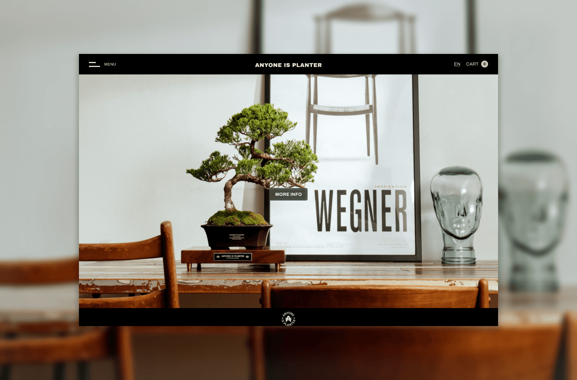
The homepage has undergone significant improvements in terms of both structure and usability. One of the key features is the blog carousel, which automatically slides through featured blog posts. If users want to learn more, they can click the "More Info" button, which will take them to the Inspo Blog section, giving them access to further content. Additionally, if the client wishes to promote a new product, they can easily switch out the featured blog posts for product information, providing flexibility for marketing purposes.
Key Changes:
I removed the previously unnecessary navigation bar and replaced the multiple menus with a single, clean hamburger menu. This simplified the navigation, allowing users to focus on the main content.
The icons that were unclear in the original design have also been addressed and made more intuitive. This reduces user confusion and makes the site easier to interact with.
The carousel feature allows for dynamic content presentation, giving the client the flexibility to easily promote new blogs or products, ensuring the homepage remains fresh and relevant.
These changes have greatly improved the homepage’s usability, making it more streamlined while giving the client control over the content they want to feature.
Prototype
1. Introduction
In this prototype, I focused on redesigning the AIP Bonsai website to resolve the navigation and information architecture issues identified during the research phase. The key goals were to simplify the structure, improve accessibility to important sections like "Services" and "Care," and provide a more intuitive experience for users. I'll walk you through the main pages and highlight the key changes made during the redesign.
Feedback
Client's Feedback
"Working with Carla on the AIP Bonsai website redesign was an excellent experience. She immediately understood our goals of making the site more user-friendly and accessible. One of the key improvements she made was restructuring the homepage to make navigation much clearer and more intuitive. She removed unnecessary elements and reorganized the layout to ensure users could easily find what they were looking for. Carla also simplified the shop page by organizing product categories, making it easier for users to browse through bonsai, furniture, and clothing. Additionally, the care guide section is now structured with a step-by-step format for tasks like repotting, which provides clear guidance to users. Carla’s attention to detail and thoughtful approach have significantly improved the site’s user experience, and we’ve already seen positive feedback from users."
4. Feedback
As I moved through the redesign process, I collected feedback to ensure that the changes were making a positive impact. Users responded well to the removal of the redundant menus and the streamlined navigation. They found the simplified structure much easier to navigate, and the elimination of the unnecessary navigation bar made the homepage clearer and more organized. Overall, the feedback reinforced the improvements made to the sitemap and navigation flow.
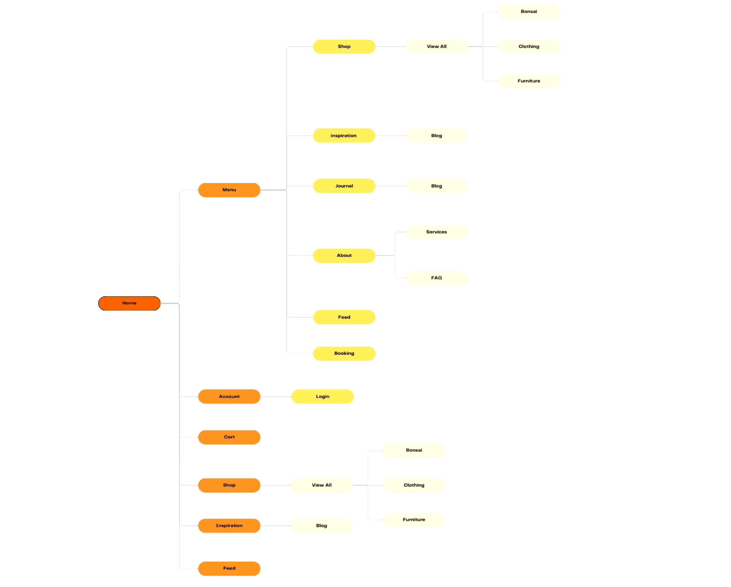
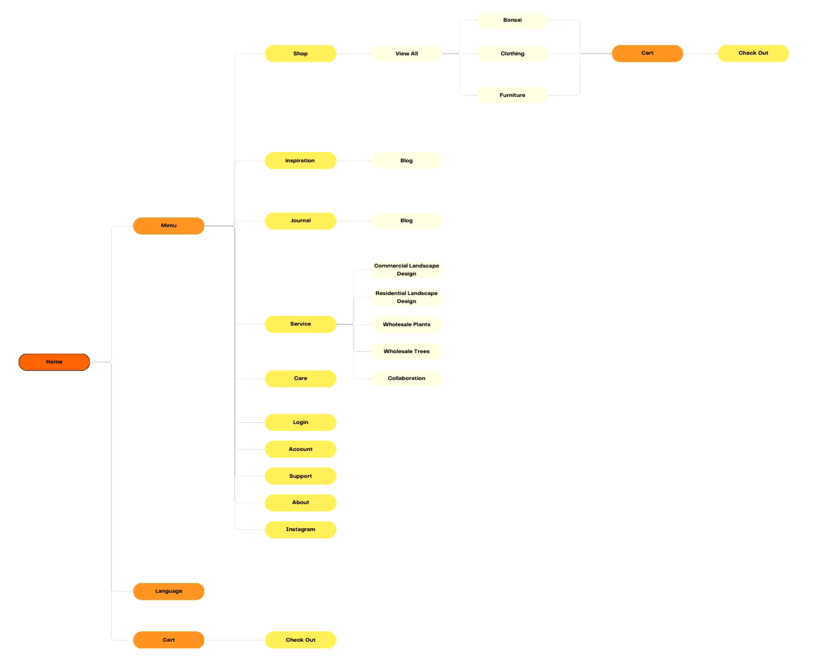
Before and After Sitemap Comparison
In the new structure, important offerings like bonsai care and landscaping services are no longer hidden. The sitemap is now streamlined, eliminating unnecessary duplication and improving the overall navigation flow. By comparing the original and redesigned versions, the changes clearly reflect a more user-centered approach to information architecture.
3. Sitemap Redesign
In the redesigned sitemap, I focused on creating a more intuitive and accessible structure. One of the key changes was moving important sections like "Services" and "Care" out from under the "About" section and giving them dedicated spaces. By giving these crucial offerings more prominence, users could easily find the information they were seeking. I also eliminated the double menus and simplified the navigation by consolidating everything into a single, clear menu. This created a more seamless user experience, making it easier for users to locate essential content without navigating through unnecessary clutter.
2. Information Architecture Review
To address the issues, I began by revising the Information Architecture (IA) of the website. The first step was to remove the redundant double menus on the homepage and eliminate the unnecessary navigation bar. I then reorganized the sitemap to provide a clearer, more intuitive structure. This included repositioning key sections and ensuring that the navigation followed a logical flow, allowing users to move through the site with ease. The revised IA simplified the layout, making the site more intuitive and user-friendly.
1. Research & Discovery
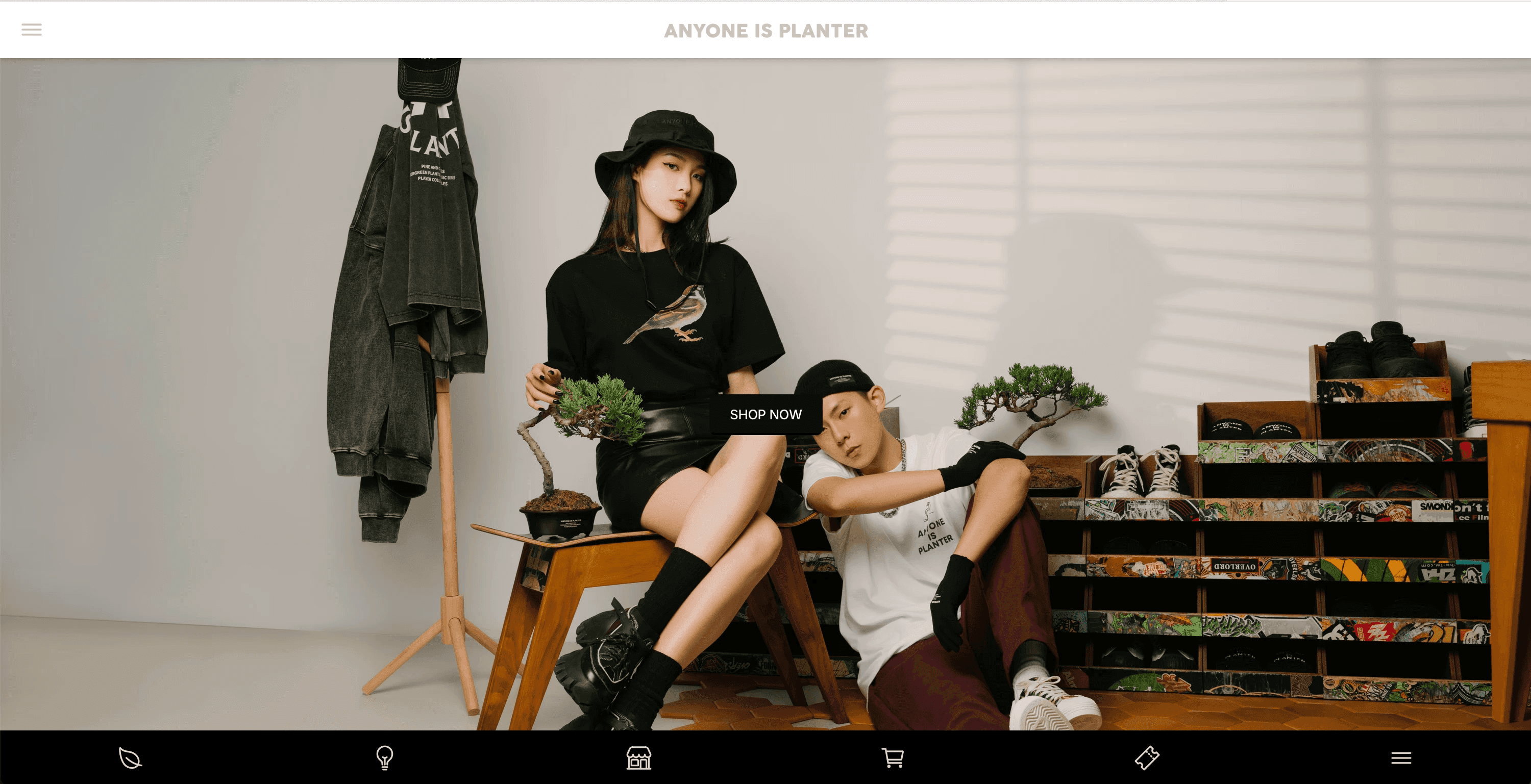
Upon reviewing the original AIP Bonsai website, I found that the primary issue was a disorganized and confusing sitemap. The structure was unclear, with important sections scattered across the site and key content hard to locate. The homepage featured two separate menus, leading to unnecessary duplication, and an additional navigation bar cluttered the interface. The icons used throughout the site were also unclear, which further added to user confusion. While there were minor issues, such as inconsistent font usage across posts, the major problem was the overall structure and navigation, which needed to be streamlined to improve the user experience.
Process
After identifying key issues with the AIP Bonsai website, I followed a structured approach to redesign the site’s information architecture, simplify navigation, and improve overall usability.
Solutions:
To enhance the user experience on the AIP Bonsai website, I implemented several key changes. First, I streamlined navigation by consolidating the double hamburger icons into a single, clearly labeled menu, eliminating confusion for users, especially first-time visitors. I also addressed the unclear icons on the homepage, refining them to be more intuitive and visually aligned with their functions, making it easier for users to understand and interact with them. Next, I clarified the menu structure by separating the brand's core offerings from the company information; services were given their own dedicated “Services” section, allowing users to quickly and intuitively navigate to important information without unnecessary delays. This new section prominently highlights offerings such as bonsai care and landscaping, providing comprehensive details, including descriptions, pricing, and booking options. By making these adjustments, users can easily find and engage with the services that interest them, leading to improved satisfaction and increased bookings.
Project
AIP Bonsai Website Redesign
Client
AIP BONSAI
Role
UI/UX Designer
Project Overview
AIP Bonsai, a Taiwanese brand specializing in bonsai trees, lifestyle products, and landscaping services, was facing several user experience challenges on its original website. The navigation was confusing, the category structure was unclear, and the checkout process felt disjointed. The client wanted to create an English version of the website that would not only address these issues but also feel fresh and modern, while still maintaining the brand’s existing aesthetic.
My role in this project was to redesign both the sitemap and wireframe to create a smoother, more intuitive user flow that would appeal to international audiences. The goal was to enhance usability, streamline the purchasing process, and better highlight the brand’s core offerings, ensuring a seamless experience that reflected the elegance and craftsmanship of AIP Bonsai’s products.
Challenges Identified
Double Hamburger Icons: The website featured two separate hamburger menu icons, leading to confusion and making navigation more complex for users. This redundant element detracted from a seamless browsing experience, particularly for first-time visitors.
Unclear Icons on the Homepage: Several icons on the homepage were unclear and did not intuitively represent their functions, leading to user confusion and difficulty in navigating through important features of the site.
Unclear Menu Structure: The original menu grouped both the brand’s services and its about information under the same section. This made it harder for users to quickly understand the company’s offerings, especially for those looking to book services.
Absence of a Dedicated Services Section: The original website had no dedicated “Services” section, burying important offerings like bonsai care and landscaping within the “About” page.


Before
After


